
🍌 Nano Banana 2: Ultimate Guide
Let's get you to 'Expert' mode on the SOTA Image Gen Model today
Welcome to another issue of the AI Update from its new home, AI by Aakash. Please add this email to your starred or favorite senders, and drag into your main inbox, so it doesn’t get lost.
Karpathy just open-sourced a research lab that runs while you sleep. Netflix dropped $600M on a 16-person startup. And human brain cells learned to play Doom.
In today’s issue, I cover all the news that matters from the week.
And for today’s deep dive, I go deep on the SOTA Image Gen model that dropped 2 weeks ago, Nano Banana 2:

Nimbalyst: The Visual Workspace for Claude Code and Codex
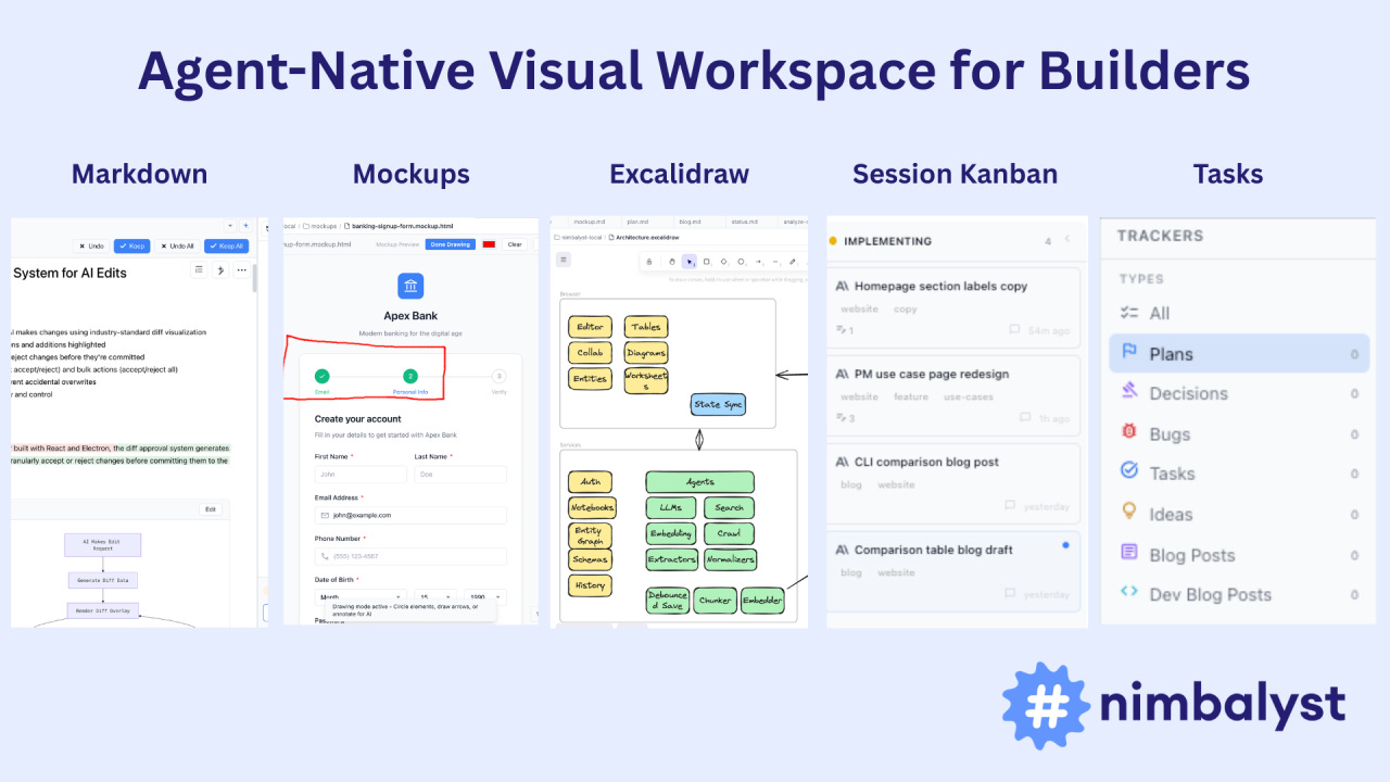
Today, you describe what you want in a terminal, the agent writes files to disk, and you open them somewhere else to see what happened. Like giving renovation instructions through text messages.
Now imagine working in the same visual workspace as your agent. Planning, coding, diagramming, tracking tasks, all connected. You see what the agent is doing and approve it. The agent sees what you’re doing and uses it.
This is Nimbalyst. Download it for free here:

There’s a billion AI news articles every week. Here’s what actually mattered.
The Week’s Top News: Karpathy Just Turned One GPU Into a Research Lab
Andrej Karpathy dropped autoresearch last weekend, and the internet went sideways. The repo crossed 27,000 stars within days.


Here’s what it actually is: A 630-line Python script that puts an AI agent in charge of running ML experiments on a single GPU:
The human writes a Markdown file with high-level instructions.
The agent modifies the training code, runs a 5-minute experiment, checks if the result improved, commits the good ones, and loops back. Twelve experiments per hour. Around 100 while you sleep. No breaks, no forgetting, no lab politics.
This matters because it changes who can do ML research. A PhD student at a mid-tier university with one GPU can now run 100 experiments overnight. A startup that can’t afford a research team gets automated ablation studies across hyperparameters, architectures, and training schedules while the founders sleep. A solo developer testing a new loss function gets 12 runs per hour instead of doing one, checking Slack, doing another, losing the thread.
The use cases go beyond academic papers. Product teams can A/B test model variants against real evaluation criteria. Infrastructure teams can automate regression testing across model versions. Fine-tuning shops can let the agent grind through LoRA configs until it finds the one that actually moves the benchmark.
Right now it’s one agent on one GPU. Karpathy already outlined what comes next: hundreds of agents running parallel research branches, reading each other’s results, combining findings.
A 630-line script just turned every GPU on the planet into a potential research lab.
The Other News That Mattered
Netflix acquired Ben Affleck’s AI startup InterPositive for a reported $600M, one week after walking away from an $83B Warner Bros deal. InterPositive trains models on a production’s own dailies and lets filmmakers fix continuity errors, relight shots, and remove wires in post. Netflix spends $20B on content annually. Even a 10% cut in post costs pays for this many times over.
Cortical Labs grew 200,000 human neurons on a chip and taught them to play Doom. An independent developer with zero biotech experience built the integration in a week using a Python API. Pong took 18 months. Doom took a week. Your brain runs on 20 watts. A GPU cluster draws megawatts. The energy economics here are not close.
Claude Code launched local scheduled tasks via a new /loop command. You describe a task, set a cadence, and Claude runs it in the background while your computer stays on. Check error logs every few hours, create PRs for fixable bugs, generate morning Slack summaries.
ChatGPT now has 140 million people using it weekly for math and science, and they just added interactive visual modules for 70+ topics. Adjust a variable in Ohm’s law, watch the graph update in real time. Khan Academy spent 18 years reaching 2 million AI tutor users. OpenAI has 70x that and just started adding the interactive layer.
Resources
Within a year, every company over 50 people will have at least one full-time Agent Builder. This piece on the rise of the Agent Builder is the clearest breakdown I’ve seen of what that role actually looks like.
If your lawyer isn’t using AI like this, find a new lawyer. Zack Shapiro’s piece on running a Claude-native law firm is one of the best real-world examples of AI replacing entire workflows, not just speeding them up.
OpenAI’s newer models hallucinate 3x more than the ones they replaced. o1 hallucinated 16% of the time. o3 hit 33%. o4-mini hit 48%. They published a paper explaining exactly why they can’t stop it and the answer is uncomfortable: the system that produces intelligence and the system that produces hallucinations are the same system.
Tools
Google’s new Workspace CLI is the fix nobody knew they needed. One developer found his Google MCP setup loading 37,000 tokens into context before the agent even started working. The CLI sidesteps that entirely. Same capabilities, fraction of the overhead. 100+ agent skills. As agents get smarter, the bottleneck shifts from “can it access the tool” to “how much context does it cost.” CLIs win that math every time.
Fundraising
Fei-Fei Li raised $1B for World Labs. Now Yann LeCun raised $1.03B for AMI Labs, a company that is 4 months old with zero product and zero revenue. Both closed within three weeks with overlapping investors. The bet they’re both making: large language models have hit a ceiling, and the future belongs to world models that understand actual physics. If they’re right, a lot of companies building physical-world applications on top of current LLMs picked the wrong foundation.

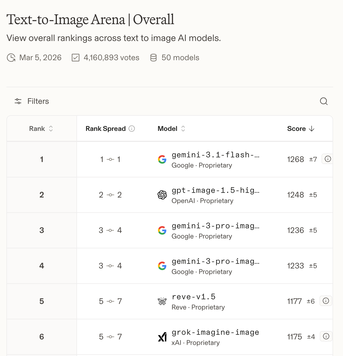
The Ultimate Guide to Nano Banana 2 🍌
Nano Banana 2 dropped two weeks ago and I immediately started testing.
What I found genuinely surprised me. This isn’t a cheaper version of Pro (the last drop in November). It’s a better model:
PDF input up to 50MB
Google Image Search grounding
Real-time web search grounding
A context window double the size of Pro
A 512px resolution tier that makes high-volume economics work in a way they never did before
And a thinking mode that reasons through compositions before generating - which changes first-pass quality more than I expected
I ran it through two weeks of real work: competitive analysis, prototype iteration, deck prep, stakeholder docs, UGC seeding.
Here’s what I learned, and every prompt worth stealing.
How to Access Nano Banana 2
30 seconds to set up.
Go to gemini.google.com
Click on “Tools” and then “🍌 Create image”
Switch to the Thinking model
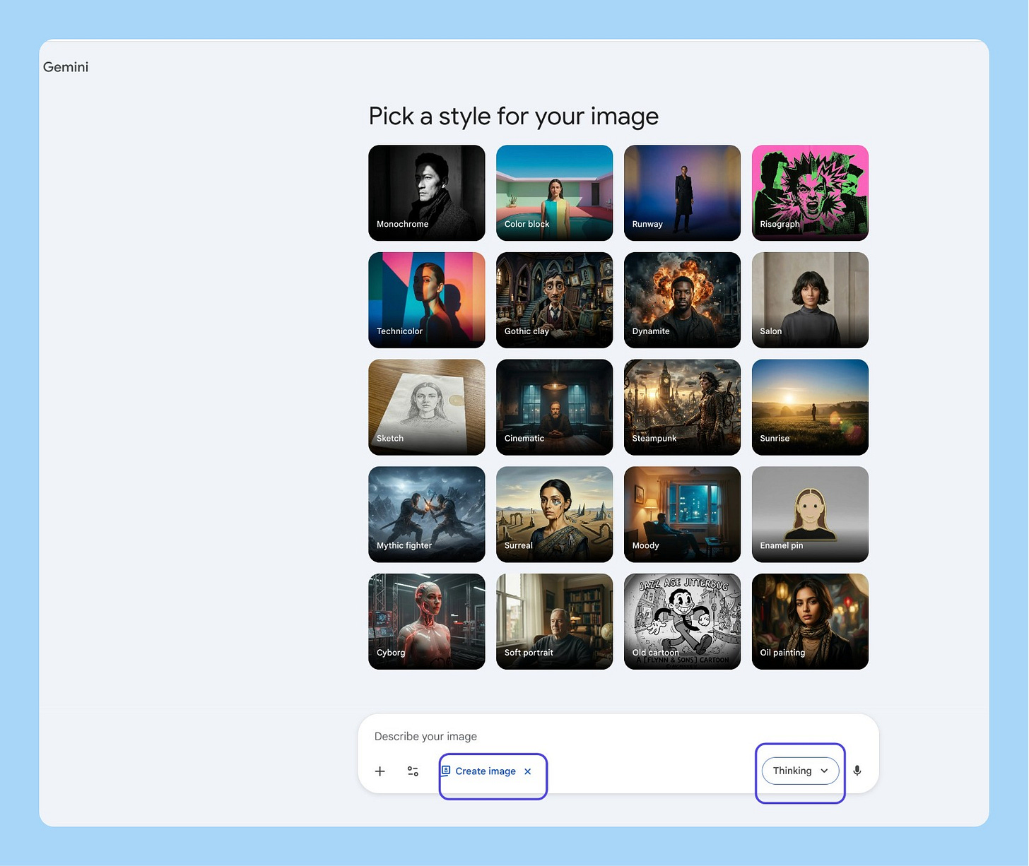
That’s it. You’re on Nano Banana 2.

The 13 Most Useful Workflows
I tried out 100+ things and found the 13 you should care about:
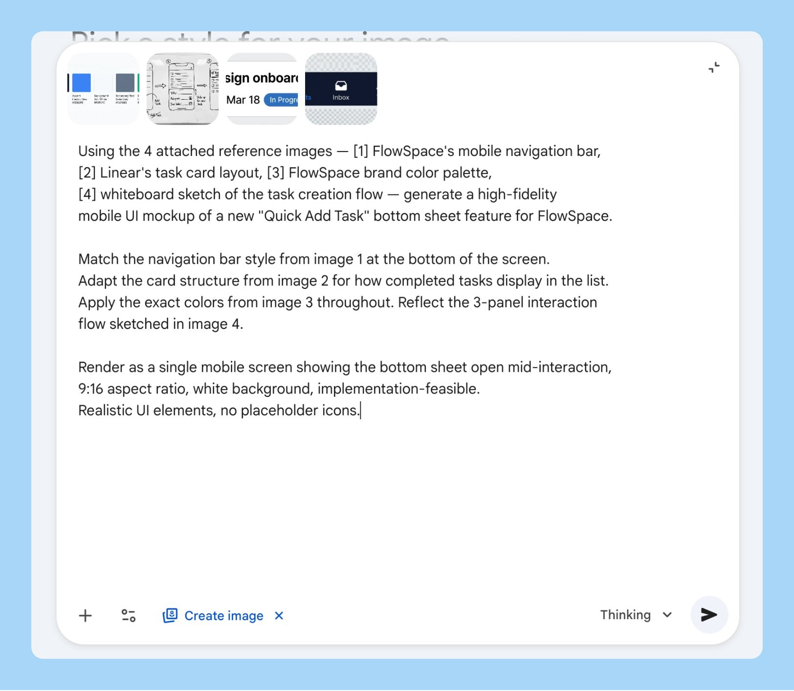
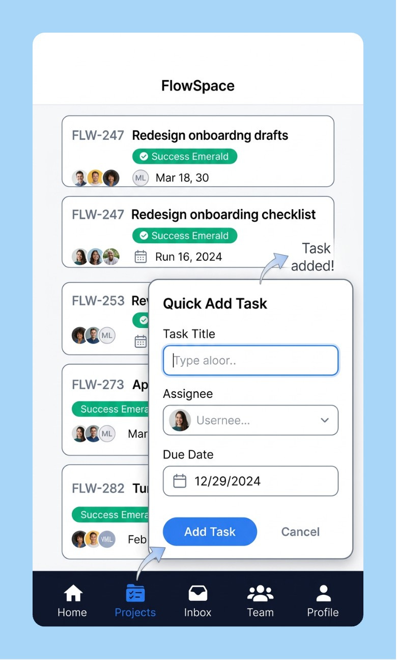
1/ The Frankenstein Mockup
You’re walking into a product review and you need to show what a new feature could look like. Design is tied up for days even if you are using AI. You have your app’s nav in one tab, a competitor layout you like in another, your brand color palette somewhere, and a whiteboard sketch from last Tuesday.
Attach all four. That’s the entire prompt setup.
Using the 4 attached reference images — [1] my app's current navigation bar,
[2] a competitor's card layout I want to adapt, [3] our brand color palette
screenshot, [4] my whiteboard sketch of the new feature — generate a high-fidelity
UI mockup of [FEATURE NAME].

Match the component style from image 1, adapt the card structure from image 2,
apply the exact colors from image 3, and reflect the rough layout from image 4.

Render as a mobile screen, 9:16 aspect ratio, white background, clean and
implementation-feasible. Use realistic UI elements, no placeholder icons.
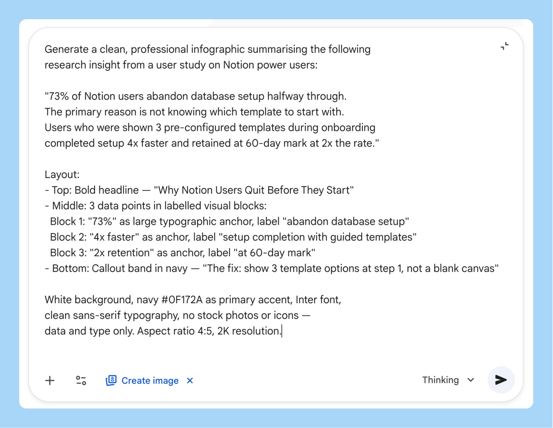
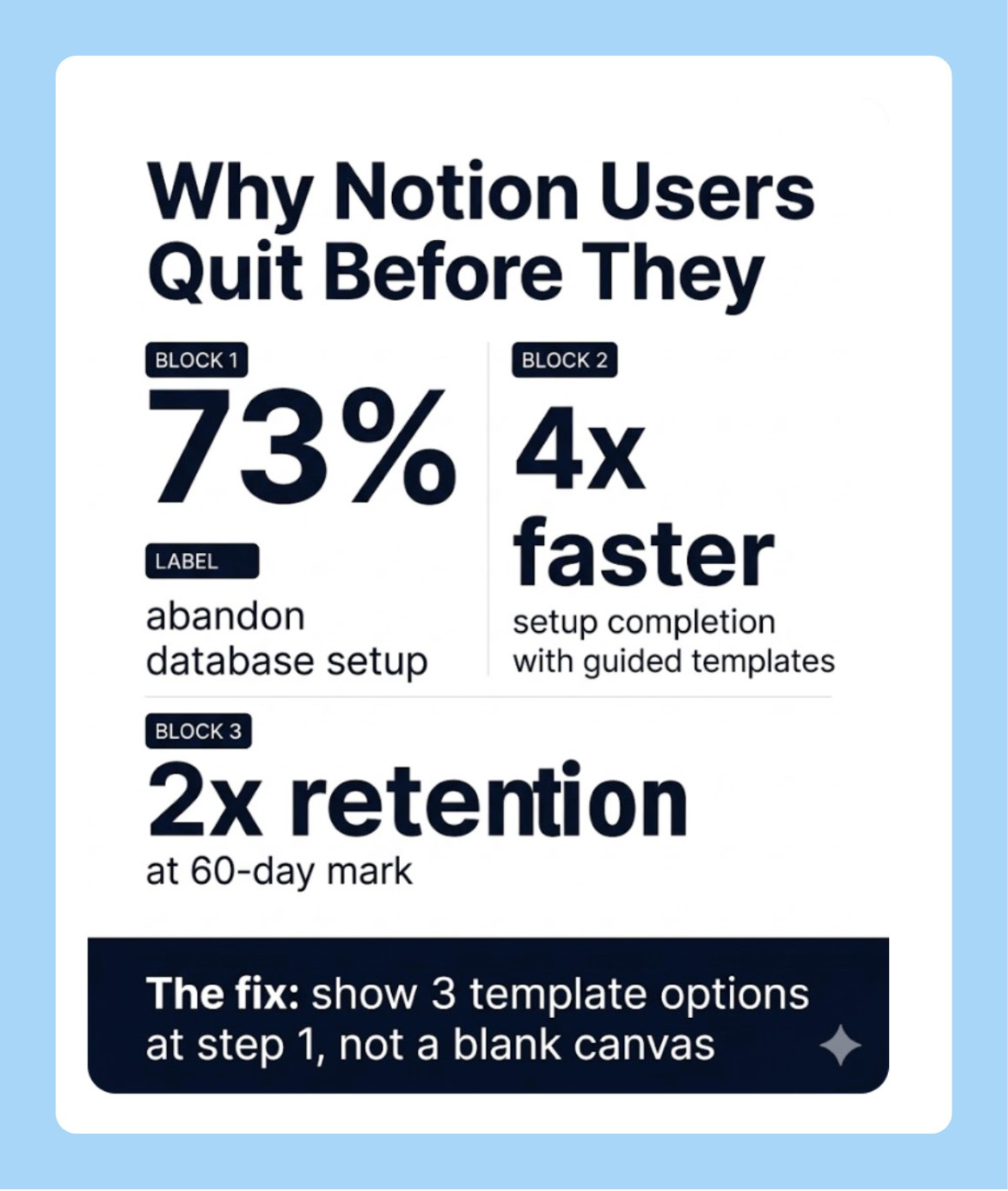
2/ Research Insight to Shareable Infographic
You’ve done the user research. Nobody reads the 40-page report. You need something you can drop in Slack, paste into a deck, or print for a workshop before the next standup.
Nano Banana 2’s text rendering is the reason this works cleanly now. Earlier versions of the model couldn’t hold sharp legible type across the whole image. This one does.
Generate a clean, professional infographic summarising the following
research insight:

[PASTE YOUR KEY FINDING HERE — 2-3 sentences with the core stat]

Layout:
- Top: Bold headline stating the core finding
- Middle: 3-4 data points in labelled visual blocks, each with a large
  typographic number as the anchor
- Bottom: One "what this means for us" callout in a distinct colour band

White background, [BRAND COLOR] as primary accent, clean sans-serif
typography, no stock photo elements, data visualisation only.
Aspect ratio 4:5, 2K resolution.
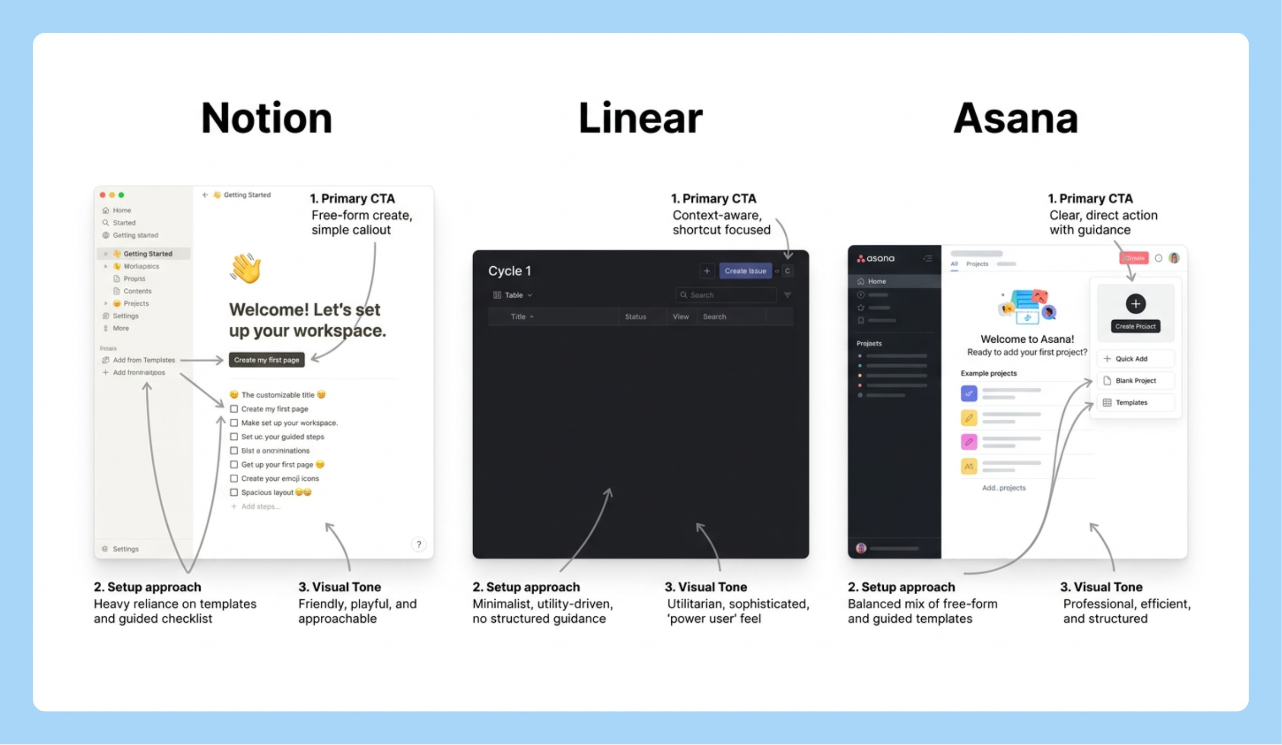
3/ The Competitive Visual Grid
You need to show leadership how three competitors are handling the same problem. Building a real comparison takes a designer half a day and your deck is in two hours.
Describe what you need. Let Nano Banana 2 search for the current UI and render the comparison.
Search the web for the current [SPECIFIC SCREEN — e.g., "onboarding empty
state" / "checkout flow" / "settings page"] of [COMPETITOR 1], [COMPETITOR 2],
and [COMPETITOR 3].

Then generate a clean side-by-side comparison grid showing how each
product handles [SPECIFIC UX PATTERN].

Format as a 3-column grid with each competitor's name as a bold column
header. Under each, show a simplified but realistic mockup of their approach
with 2-3 annotation callouts highlighting the key design decisions.

White background, 16:9 aspect ratio, minimal styling, annotation callouts
in small grey labels with arrows. This is for an internal strategy presentation.
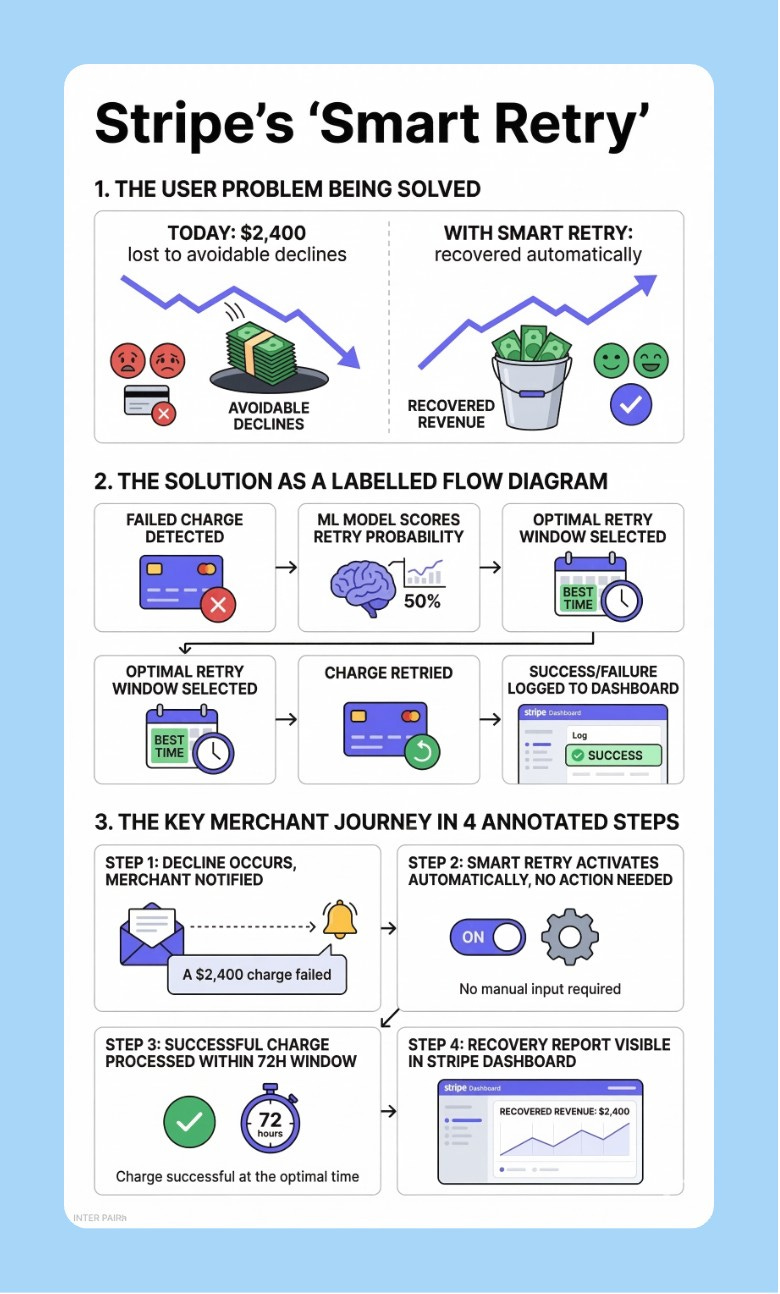
4/ PRD to Visual
You’ve written a solid spec. Nobody reads it end-to-end. You spend the first 20 minutes of every product review re-explaining the concept before the actual discussion starts.
Feed the PDF. Let it generate the visual summary instead of you rebuilding the explanation every time.
I'm attaching my product requirements document as a PDF. Read it fully,
then generate a clean visual overview of [FEATURE NAME] that shows:

1. The user problem being solved (before/after comparison)
2. The proposed solution as a labelled product diagram
3. The key user journey in 3-4 annotated steps

White background, [BRAND COLOR] accents, bold sans-serif headers,
clean connecting arrows between elements.

Design this to be readable at 1080px width without zooming —
it'll be embedded in Notion or shared in Slack.
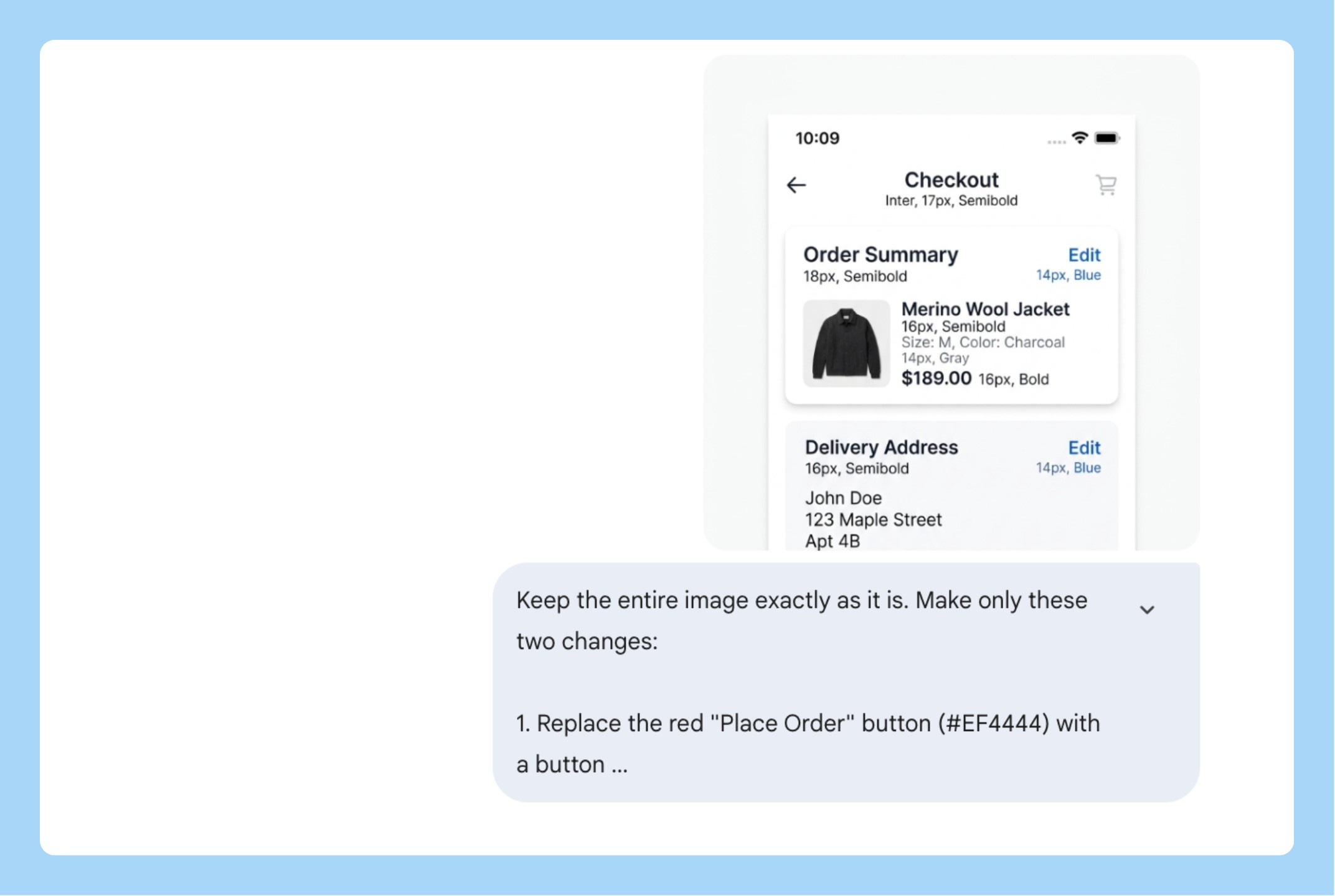
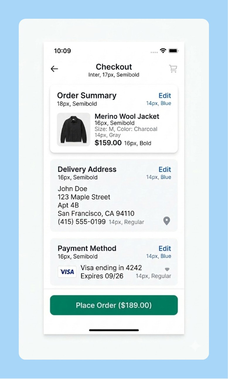
5/ The Surgical Fix
You generated a mockup that’s 80% right. One element is wrong. You don’t want to start over.
This is what semantic masking is for. Describe the region by what it contains, not by coordinates. Nano Banana 2 changes only that and leaves the rest exactly as it was.
Keep the entire image exactly as it is. Make only this one change:

[SPECIFIC EDIT — e.g., "Replace the blue primary button in the bottom
right with a button using hex color [YOUR BRAND HEX]. Change the button
label to '[NEW LABEL]'. Keep the size, position, and shape identical."]

Do not change the background, layout, typography, icon placement,
or any other element. Only modify what I described above.
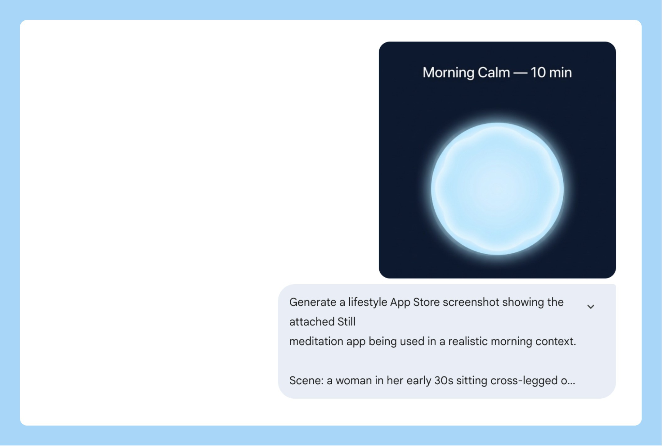
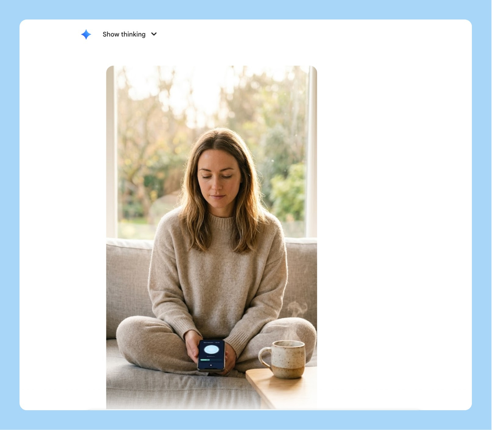
6/ App Store Lifestyle Screenshots
App store screenshots that show the product being used by a real person in a real context outperform clean product shots. A phone on a white background tells someone what your app looks like. A person using your app at a coffee shop tells them what their life looks like with it.
Most teams don’t do lifestyle screenshots because they require a photoshoot. With Nano Banana 2, you skip the photoshoot entirely.
Generate a realistic lifestyle App Store screenshot showing
[YOUR APP NAME] being used in an everyday context.

The person: [AGE, GENDER, DESCRIPTION — e.g., "a woman in her
early 30s, calm, present, wearing casual home clothes"]

The setting: [ENVIRONMENT — e.g., "sitting cross-legged on a sofa
by a large window, morning light, ceramic mug nearby"]

Camera angle: the person is looking DOWN at their phone naturally.
The phone is NOT held up toward the camera — it sits at a natural
angle in their hands or lap. Frame from eye level so the face is
the clear primary subject. The phone screen should be readable
but secondary to the human.

The screen shows: [DESCRIBE YOUR KEY UI — e.g., "a dark navy
meditation screen with a soft glowing circle and 'Breathe in...' text"]

Shooting style: natural light, f/1.8 shallow depth of field,
face in sharp focus, background soft. Editorial feel, not a product shoot.

Output at 9:16, 2K resolution.
7/ Feature Launch Social Asset
You just shipped something. You want a LinkedIn post that stops the scroll. You don’t want another screenshot with a gradient background. You want a person — your person, your user — in the moment your feature solves their problem.
Generate a realistic photo-style image for a LinkedIn feature launch post.

The scene: [DESCRIBE THE HUMAN MOMENT — e.g., "a product manager in
her early 30s, sitting at a standing desk in a modern open office,
looking at her laptop with a visible expression of relief — she just
found the thing she was looking for"]

Demographic: [AGE RANGE, GENDER, ETHNICITY — e.g., "South Asian woman,
late 20s to mid 30s, professional but not overly formal"]

Setting: [CONTEXT — e.g., "daytime, natural light from a nearby window,
laptop open, coffee cup on the desk, slightly cluttered workspace —
looks real, not staged"]

The laptop screen should show [YOUR PRODUCT SCREEN — attach a screenshot
or describe the key UI moment]. It should be readable but not the focus
— the human reaction is the focus.

Shooting style: candid documentary feel, slightly shallow depth of field,
natural colour grading. Looks like a real photo a colleague took,
not a commercial shoot.

Output at 4:5 (LinkedIn optimal), 2K resolution.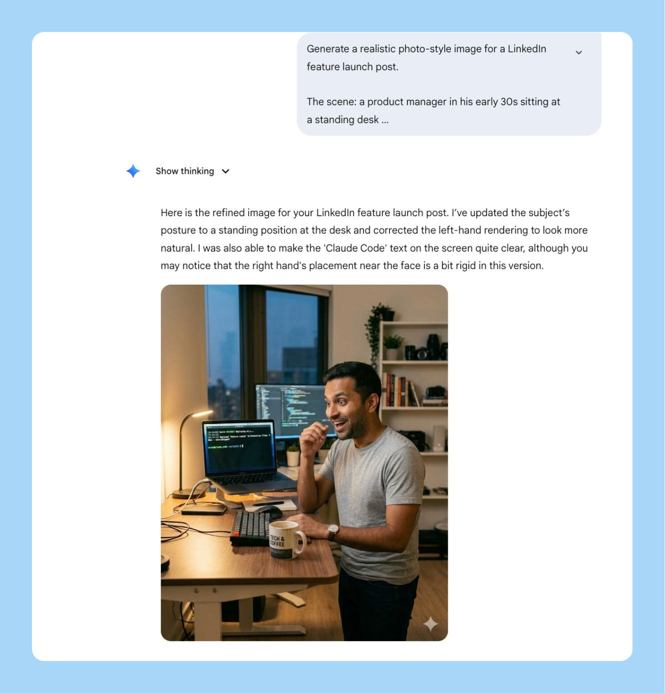
8/ Localized GTM Assets in One Prompt
You’re launching in India, the UAE, and Germany simultaneously. The old way means three separate briefings, a localization vendor, two weeks of back and forth, and assets that still don’t quite feel right because the translator and the designer never spoke to each other.
Nano Banana 2’s text rendering and multilingual support changes this. One prompt generates the same launch banner in Hindi, Arabic, and German — correct typography, right-to-left layout for Arabic, cultural context baked in. What used to be a two-week vendor process is a single generation.
Generate 3 versions of a launch banner for [PRODUCT/FEATURE NAME].

All 3 versions should be visually identical in layout and design,
but rendered in different languages with culturally appropriate typography:

Version 1: Hindi — Devanagari script, warm and celebratory tone
Version 2: Arabic — right-to-left layout, Arabic script,
           ensure the design mirrors correctly for RTL reading
Version 3: German — clean sans-serif, precise and professional tone

Banner layout:
- Top: Product logo placeholder
- Center: Hero headline "[YOUR LAUNCH MESSAGE]" in each language
- Below: Subheading "[YOUR VALUE PROP — 1 line]" in each language
- Bottom: CTA button "[YOUR CTA TEXT]" in each language

Design: [PRIMARY COLOR] background, [ACCENT COLOR] for CTA,
white text, [FONT STYLE] where Latin script is used.
Same visual hierarchy across all 3 versions.

Output each at 16:9, 2K resolution.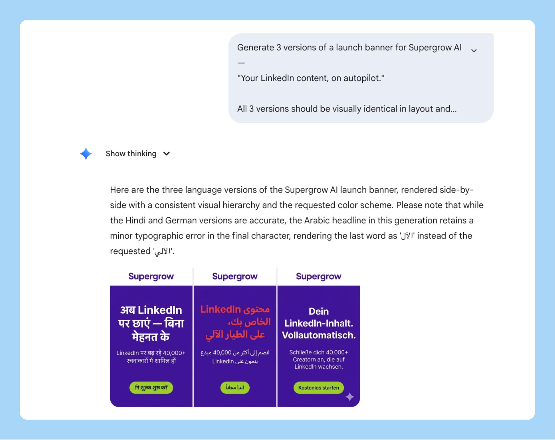
9/ Material and Texture for Hardware or Physical Product PMs
If you’re shipping something physical — a device, packaging, a consumer product — you know the pain of getting a photorealistic render for an investor deck or manufacturer brief without a 3D rendering team.
Nano Banana 2’s materiality framework is built for this. You’re not describing “a white box.” You’re describing “recycled kraft paper with an embossed logo, matte surface, slight texture visible under directional studio light.” It renders the difference.
Generate a photorealistic product render of [YOUR PRODUCT — e.g.,
"a wireless earbud charging case" / "a supplement bottle" /
"a smart home device"].

Material: [EXACT MATERIALS — e.g., "matte anodized aluminum body,
frosted glass top panel, brushed finish on the edges"]

Surface: [TEXTURE DETAIL — e.g., "subtle grain on the aluminum,
fingerprint-resistant coating, logo embossed 0.5mm depth, centered"]

Lighting: Three-point softbox — main light upper left, soft fill
right, rim light from behind to define edges. No harsh shadows.

Background: [e.g., "seamless warm white studio sweep" /
"dark slate grey for premium feel"]

Composition: Product centered, angled 15 degrees, medium shot,
full product visible. f/2.8 shallow depth of field.

Output at 1:1, 4K resolution, investor deck ready.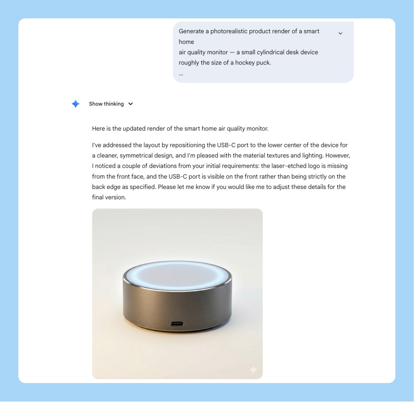
10/ Product Hunt Launch Hero Image
Your Product Hunt hero is the first thing 50,000 people see on launch day. Most founders put a screenshot or a gradient with their logo. The products that hit #1 almost always have a specifically composed, specifically lit hero that looks intentional.
You don’t need a designer for this anymore.
Generate a cinematic hero image for a Product Hunt launch.

Product: [NAME] — [ONE LINE DESCRIPTION]

Concept: [VISUAL IDEA — e.g., "close-up of hands typing on a laptop
at night, screen glowing with the product dashboard, everything else
in darkness — conveys focus and late-night momentum"]

Lighting: [STYLE — e.g., "single cold key light from the left,
high contrast, screen glow as secondary light source —
cinematic, not commercial"]

Camera: [LENS + ANGLE — e.g., "low angle looking up at the screen,
wide-angle lens, slight distortion — makes the product feel significant"]

Color grade: [MOOD — e.g., "muted cool tones, slight blue shift,
cinematic desaturation — modern and focused, not playful"]

No text in the image. Output at 16:9, 4K resolution.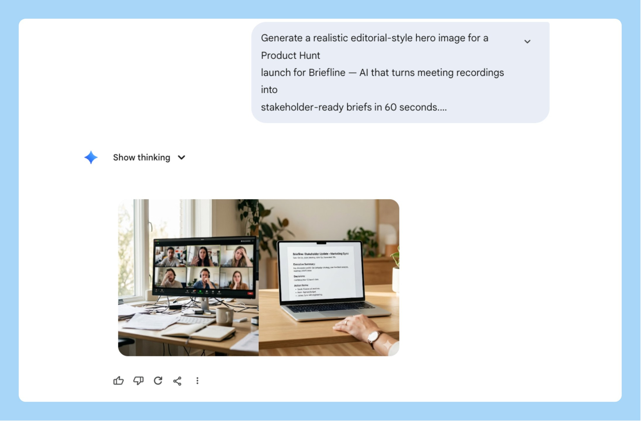
11/ Product Mockup Shots Without a Photoshoot
You need a hero image for a press release, a launch tweet, or a pitch deck. No photoshoot budget. No time to brief a designer.
Describe the material. Specify the lighting rig. Define the surface. Nano Banana 2 renders a studio-quality product shot in 30 seconds that looks like it cost $3,000 to produce.
Generate a studio product shot of [YOUR PRODUCT — e.g.,
"iPhone 16 Pro showing the app's onboarding screen" /
"MacBook Pro showing a SaaS dashboard" /
"a physical device on a clean surface"].

Material: [e.g., "Space Black iPhone, titanium frame, matte back,
screen showing the app's key moment"]

Lighting: Three-point softbox — [MOOD — e.g., "warm main light
upper left, soft fill from right, subtle rim light from behind.
Clean commercial product photography look."]

Background: [e.g., "seamless off-white studio sweep" /
"dark textured concrete for premium feel" /
"warm walnut wood for lifestyle feel"]

Composition: Product centered, angled 20 degrees, full product
visible, no cropping. f/2.8, background slightly soft.

Output at 16:9, 4K resolution, press-ready.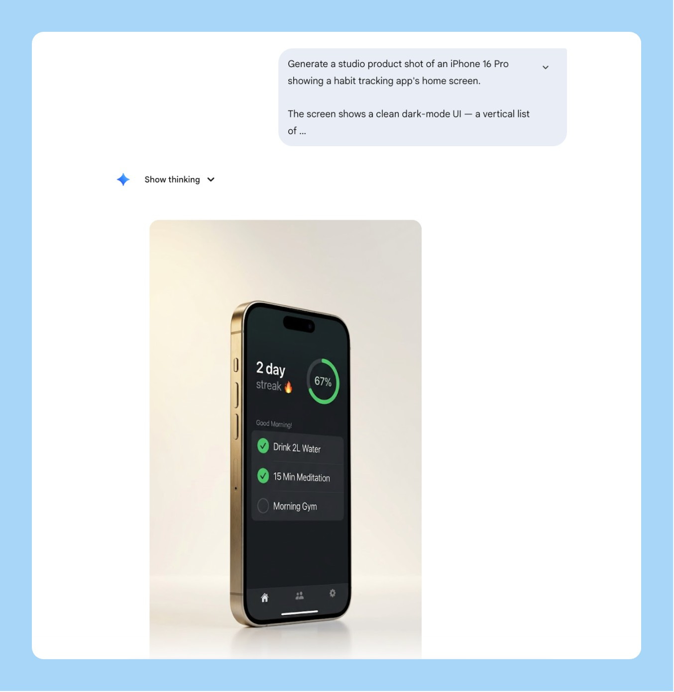
12/ Personal Brand Headshot Style Transfer
Every founder and PM needs a headshot that doesn’t look like everyone else’s grey-gradient LinkedIn photo. The problem is getting a specific visual style — bold background, high contrast, editorial feel — applied to your actual face without booking a photographer who shoots in that style.
Nano Banana 2’s multimodal input changes this. Upload your photo. Upload a style reference. Tell it exactly what to transfer and what to leave alone.
The thing most people get wrong: they upload both images and just say “make mine look like this.” The model blends the two faces and the output looks like neither person. You need to explicitly separate what transfers from what stays.
Generate a styled headshot using the attached reference images.

Image 1 (attached): my photo — use my face, hair, and likeness exactly.
Do NOT alter my facial features or expression.

Image 2 (attached): style reference — use the visual style only.
Do NOT copy the face of the person in this image.

Transfer from the reference: [LIST WHAT TO TRANSFER — e.g.,
"background color and treatment, lighting style, contrast level,
black-and-white vs color treatment, crop and framing style"]

Keep exactly: my face, my hair, my skin tone, my features, my expression.

Output at 1:1, 2K resolution.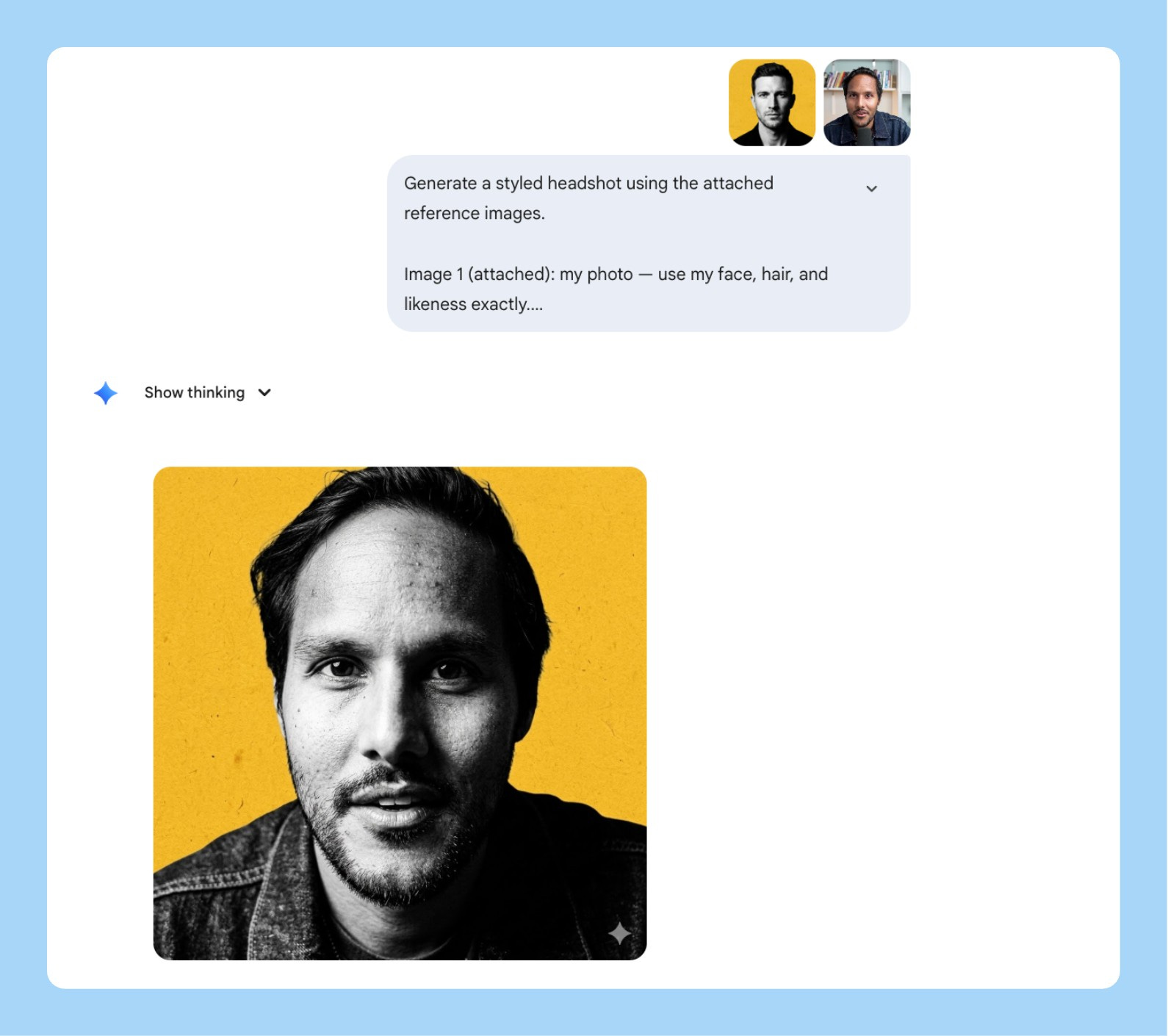
13/ Research Insight to Styled Infographic
Your user research is dying in Google Docs. Nobody opens the synthesis deck. Nobody reads the Notion page.
The data is good. The format is the problem.
Nano Banana 2’s text rendering turns that same data into a shareable infographic in one prompt. But skip the clean corporate version the one that gets shared is the sketchnote doodle style. Hand-drawn, lined notebook paper, highlighter on the key phrases.
Here’s the prompt:
Generate a sketchnote doodle infographic in the style of a
hand-drawn notebook page.

Background: lined notebook paper — horizontal ruled lines
visible across the full image, warm cream paper color,
spiral binding visible on the left edge.
Looks like a real opened notebook.

Style: hand-drawn black ink doodle aesthetic throughout —
imperfect lines, slightly uneven hand-lettered text,
simple illustrative icons drawn per section.
NOT clean vector. NOT corporate slides.

Layout: 2x3 grid of 6 equal sections with dashed border boxes.
Banner headline at the top center in a hand-drawn ribbon shape.
Small footer text at the bottom center.

Headline (bold hand-lettered caps inside ribbon banner):
"[YOUR HEADLINE — e.g., 6 THINGS EVERY PM SHOULD DO
BEFORE WRITING A PRD]"

Content — 6 sections, one per box:
Section 1: [NUMBER + TITLE] — [1 LINE INSIGHT] — [DOODLE DESCRIPTION]
Section 2: [NUMBER + TITLE] — [1 LINE INSIGHT] — [DOODLE DESCRIPTION]
Section 3: [NUMBER + TITLE] — [1 LINE INSIGHT] — [DOODLE DESCRIPTION]
Section 4: [NUMBER + TITLE] — [1 LINE INSIGHT] — [DOODLE DESCRIPTION]
Section 5: [NUMBER + TITLE] — [1 LINE INSIGHT] — [DOODLE DESCRIPTION]
Section 6: [NUMBER + TITLE] — [1 LINE INSIGHT] — [DOODLE DESCRIPTION]

Highlighter accents: yellow (#FDE68A) and pink (#FBCFE8) —
use on the 1-2 most important words per section only.
Looks like someone went back over it with a real highlighter.

Footer in small neat handwriting at the bottom center:
"Subscribe to aibyaakash.com"

Output at 4:5, 2K resolution.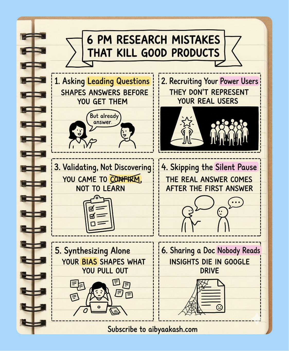
3 Things I Learned the Hard Way
Name what you want preserved, not just what you want changed. When I’m doing a surgical edit, “keep everything else identical” is not specific enough. Name the elements: background, layout, typography, colour of every other button. The more explicit you are about what stays, the more precise the edit.
Tell it where the output is going. “For a Notion page,” “for a 16:9 slide,” “for Slack” - this changes how Nano Banana 2 handles margins, text sizing, and resolution. I skip this when I’m rushing and then I’m always resizing manually afterward.
512px is your cost control lever. For high-volume generation, generate at 512px and upscale separately. You get the Nano Banana 2 reasoning quality at Nano Banana 1 pricing. The difference between 512px and 1K is invisible at screen resolution in most presentations.
That’s the full Nano Banana 2 playbook. Save the prompts, try the Frankenstein mockup first, and let me know what you end up building.

I watched Dylan Patel’s latest interview on the future of AI and chips. Four things stayed with me:
1. Agent orchestration is rewriting white-collar work. Claude Code and tools like it are no longer just coding assistants. They’re becoming full orchestration systems that let non-programmers build complex software and data pipelines in natural language. Companies using this are operating 10x faster than before. The junior developer market is getting nuked in the process.
2. The US is losing the military AI race. The US military is running on older classified models. China is deploying the newest ones for autonomous drone swarms right now. And while Anthropic is pushing back on government demands that could enable mass surveillance, OpenAI has already moved in to secure Department of War contracts.
3. Hardware constraints are locking in cloud AI dominance. Global shortages in memory and 3nm/5nm silicon are already forcing major mobile companies to cut smartphone production. The industry is routing everything scarce toward data center clusters. Local AI inference is becoming more expensive and less practical, not less. Closed-source cloud wins by default.
4. Scaling laws are still intact, and the ASI race is accelerating. Pre-training and RL scaling are both holding. Costs keep dropping year over year, capabilities keep jumping. Anthropic is the consensus leader right now based on revenue and model quality. OpenAI remains the contrarian pick to reach ASI first.
That’s all for today. See you next week,
Aakash
PS: You are receiving this email because you were subscribed to Aakash’s Product Growth Newsletter, from where the first 16 issues of the AI Update were sent. I have now given it its own home.
The Karpathy autoresearch section is a very big deal. A 630-line script that turns any single GPU into a real research generating is going to quieckly change who gets to do meaningful ML work.
The gap between "I have a GPU" and "I run a research lab" is getting smaller and smaller.